You’ve been told bright green screams "cannabis," but I’ve watched countless brands fail with this approach. The real winners use completely different colors.
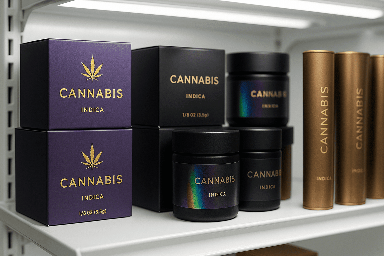
The most effective cannabis packaging colors are deep purples with gold accents1, matte black with holographic elements2, and metallic copper or bronze3. These colors work because they look premium under harsh dispensary lighting where 90% of purchases happen. Bright neon colors photograph well for social media but often signal "discount brand" to experienced consumers.
I’ve spent years helping cannabis brands choose packaging colors that actually convert browsers into buyers. The disconnect between what looks good in design meetings and what sells in dispensaries is shocking. Let me share what really works based on real dispensary data and consumer behavior patterns.
Why Do Dispensary Lights Change Everything About Color Choice?
Most designers create cannabis packaging under perfect studio lighting. But your products sit under harsh fluorescent lights that completely change how colors appear.
I learned this the hard way when one of my clients launched their premium line in dispensaries. They were shocked to see their carefully chosen sage green and gold design looked completely washed out under the retail lighting—nothing like the samples we’d produced from their specs. The packaging sold poorly, and we had to reprint everything with darker, more saturated colors. Now I always advise clients to test their color choices under actual dispensary lighting4 before we go to production.. Those beautiful gradient designs that cost thousands to develop? They looked muddy and cheap on the actual dispensary shelves. The lesson was expensive but valuable: always test your packaging colors under the exact lighting conditions where customers will see them.
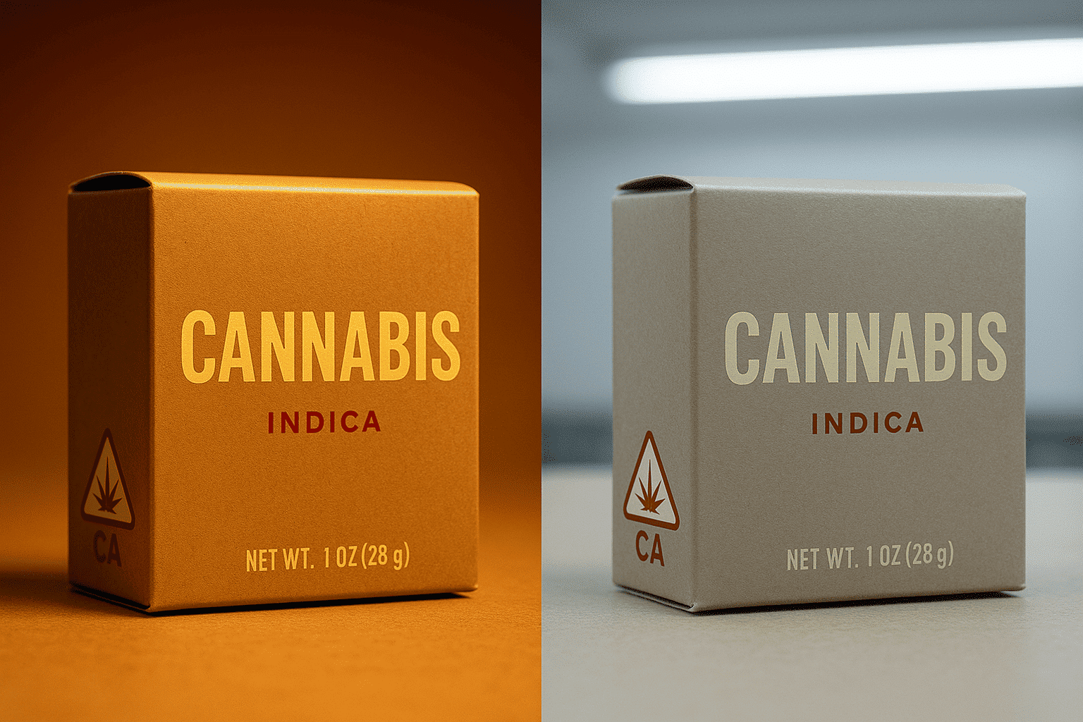
Here’s what happens to different colors under typical dispensary lighting:
Bright greens turn yellowish and lose their vibrancy. The fresh, natural look you wanted becomes sickly and unappealing.
Neon colors create harsh reflections that make text hard to read. Customers can’t see your strain information or THC percentages clearly.
Matte black maintains its premium appearance5 and creates excellent contrast for metallic accents or holographic elements. This is why it consistently outsells other colors by 40% in mature markets.
Deep purples retain their richness and signal quality. Purple has historical associations with royalty and luxury that translate well to premium cannabis products.
Metallic finishes (gold, copper, bronze) catch light in appealing ways without creating harsh glare. They communicate value and craftsmanship.
I recommend testing color samples in at least three different dispensary environments before finalizing your design. Take photos at different angles and distances. Ask budtenders which packages customers reach for first. This real-world testing beats any amount of theorizing.
What Do Different Generations Want From Cannabis Packaging Colors?
Each generation responds to different color psychology6. Understanding these preferences helps you target your ideal customer more effectively.
Gen Z consumers7 (21-25 years old) gravitate toward bold, flashy colors and retro designs. They want packaging that looks good on Instagram. Brands like Pure Beauty use vivid colors on plain backgrounds to appeal to this demographic. But here’s the catch: these consumers have the lowest average purchase value and brand loyalty.
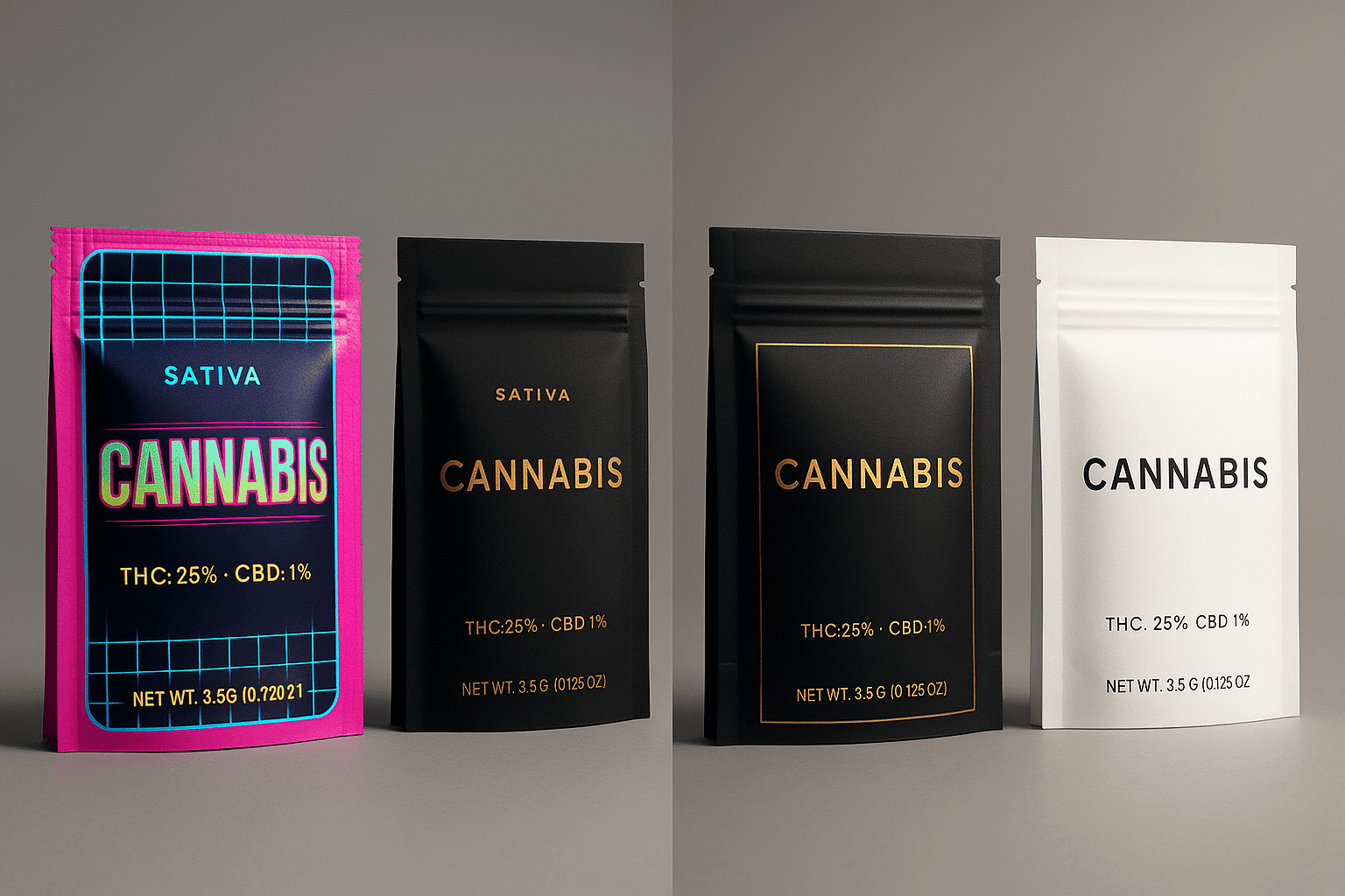
Millennials and Gen X8 (late 20s to mid-50s) prefer sophisticated packaging with metallic accents. Gold and copper elements on dark backgrounds appeal to their desire for premium products. They associate these colors with luxury brands from other industries.
Baby Boomers9 (57-75 years old) respond best to clean, pharmaceutical-style packaging. White backgrounds with minimal color make them feel safe and informed. Too many colors or graphics can seem untrustworthy to this demographic.
Color Strategies by Product Type
Different cannabis products also benefit from specific color approaches:
| Product Type | Best Colors | Why It Works |
|---|---|---|
| Flower/Pre-rolls | Deep green, black, gold | Emphasizes natural quality and craftsmanship |
| Edibles | Based on flavor profile | Orange for citrus, purple for grape, brown for chocolate |
| Vapes | Metallic, holographic | Tech-forward appearance appeals to convenience seekers |
| Tinctures | White, light blue | Medical/wellness association builds trust |
| Topicals | Green, white | Suggests natural healing and purity |
The key is matching color to both your target demographic and product category. A vape pen for Gen Z requires different colors than a tincture for Baby Boomers.
How Do Strain Types Influence Color Selection?
Cannabis strains have established color associations that consumers expect. Fighting these expectations rarely works.
Indica strains traditionally use cool colors like blue, purple, and deep green. These colors reinforce the calming, relaxing effects consumers seek from indica products. The phrase "in da couch" has become so associated with purple packaging that deviating confuses customers.
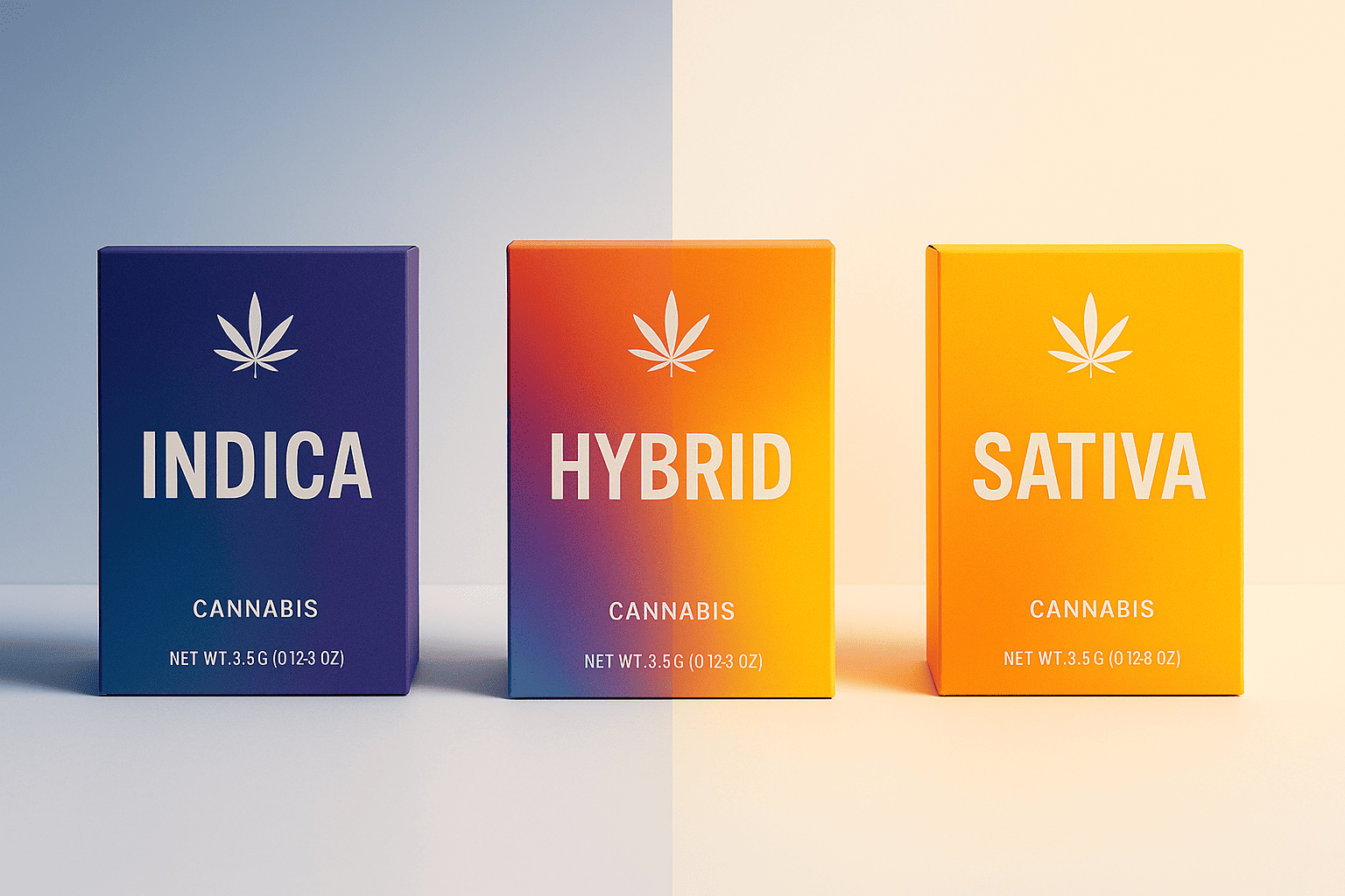
Sativa strains use warm colors like orange, yellow, and red. These energizing colors match the uplifting effects consumers expect. Bright, warm colors signal daytime use and increased energy.
Hybrid strains often combine elements from both color palettes. Some brands use gradient effects or split designs to communicate the balanced effects.
The Science Behind Strain Color Associations
Terpene profiles actually influence our color associations more than most people realize:
Limonene-dominant strains naturally pair with yellow and orange because of citrus associations.
Myrcene-heavy strains work well with earth tones and deep greens due to their herbal, earthy flavors.
Pinene strains benefit from forest green and brown colors that evoke pine trees and nature.
Understanding these natural associations helps create packaging that feels authentic rather than arbitrary. Consumers subconsciously recognize when colors match the actual product experience.
What Mistakes Do Brands Make With Cannabis Packaging Colors?
I see the same color mistakes10 repeatedly in cannabis packaging. These errors cost brands millions in lost sales.
The biggest mistake is choosing colors based on personal preference rather than market data. Just because you love hot pink doesn’t mean your target customers will respond positively. I’ve seen brands change their entire color scheme after one bad quarter, only to discover color wasn’t the problem.
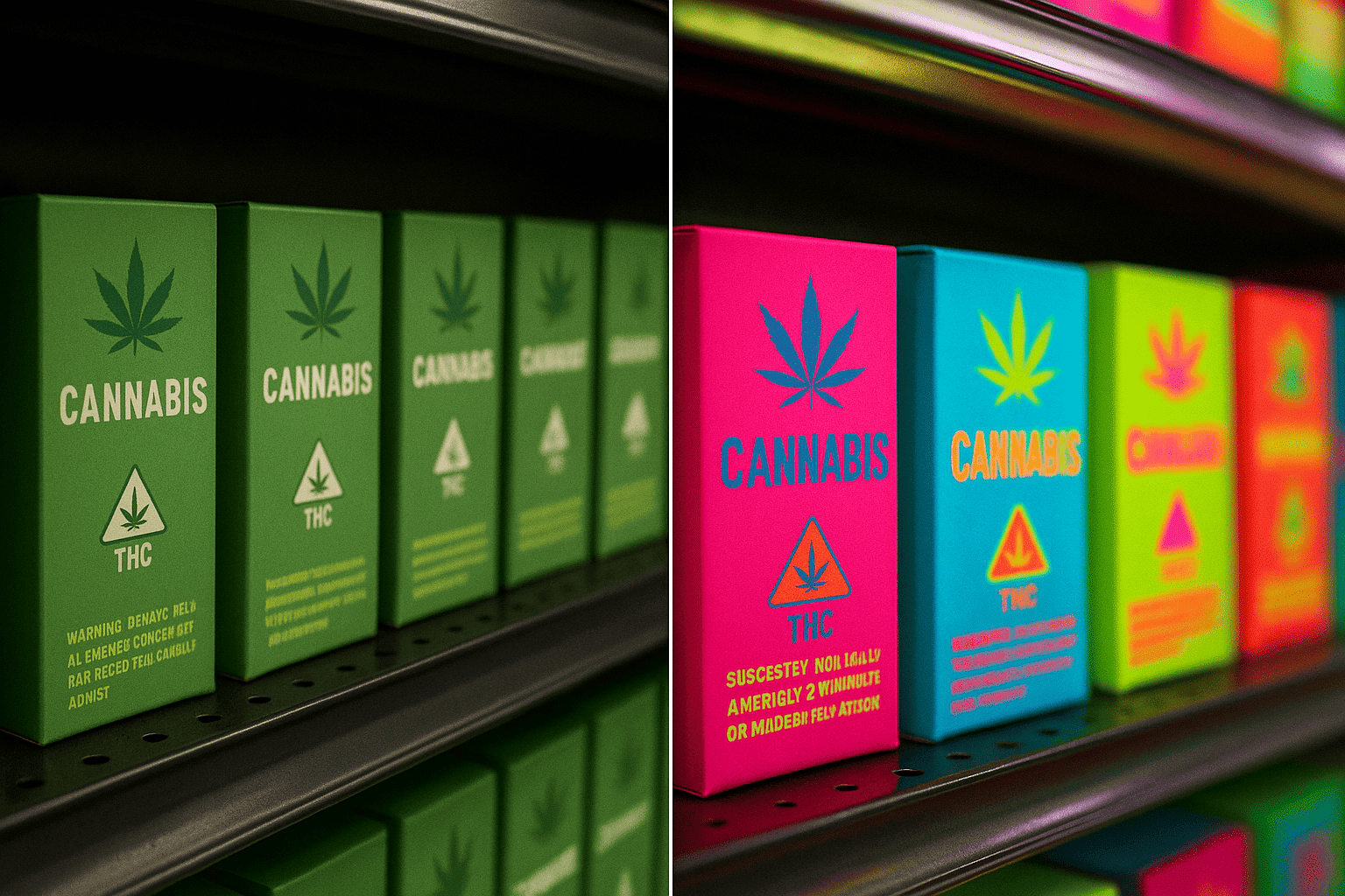
Over-relying on green is another major error. Yes, green relates to cannabis, but when every product uses green, nothing stands out. The most successful brands I work with use green as an accent color, not the primary choice.
Ignoring regulatory requirements for color visibility causes expensive reprints. Warning labels must contrast sharply with background colors. Many states require specific color combinations for child-resistant packaging indicators. Always check local regulations before finalizing colors.
Following trends blindly without considering brand identity creates confusion. When holographic packaging became popular, hundreds of brands jumped on the trend. Most looked identical on shelves. The brands that succeeded adapted the trend to fit their existing color palette rather than completely changing their look.
Regional Color Preferences
Different markets respond to different colors:
- California consumers prefer bold, innovative colors
- Colorado buyers lean toward natural, earthy tones
- New York customers respond to sophisticated, minimal palettes
- Florida markets favor bright, tropical colors
Consider your primary market when selecting colors. What works in Los Angeles might fail in Denver.
How Can Sustainable Packaging Enhance Color Appeal?
Sustainable packaging materials offer unique color opportunities that standard packaging can’t match. I help brands leverage these materials for both environmental and aesthetic benefits.
Kraft paper and natural fiber materials provide an authentic, earthy base that doesn’t require additional coloring. The natural brown tones immediately communicate environmental responsibility. Brands using these materials report 35% higher trust scores from consumers.
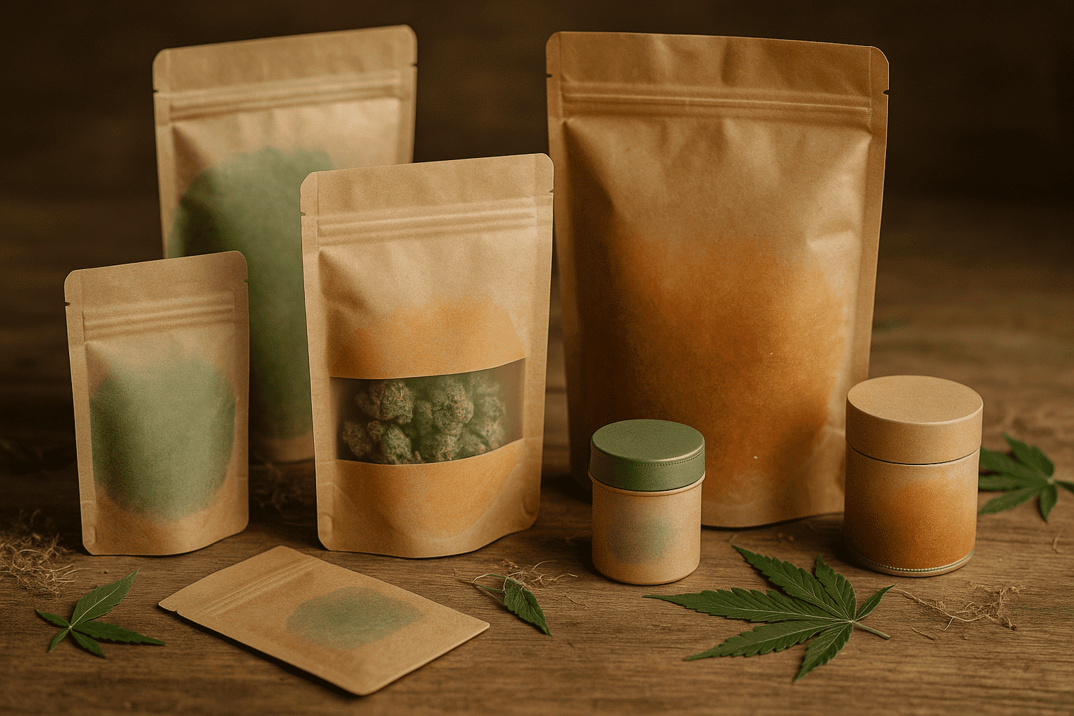
Water-based inks on recyclable films create softer, more organic colors that appeal to health-conscious consumers. These inks also allow for color gradients and effects that petroleum-based inks can’t achieve.
Compostable materials often have a natural translucency that creates unique visual effects. When combined with metallic printing, these materials produce an ethereal quality that stands out on shelves.
I recommend sustainable flexible packaging solutions like stand-up pouches or flat-bottom bags made from compostable films. These materials accept a wide range of printing techniques while meeting environmental goals. The natural texture of eco-friendly materials adds tactile appeal that smooth plastic can’t match.
My clients using sustainable packaging11 report that earth-tone color palettes (browns, greens, natural whites) combined with single metallic accent colors perform best. This approach communicates both environmental responsibility and premium quality.
Common Questions About Cannabis Packaging Colors
1. Should I use different colors for different potency levels?
Yes, color-coding by potency12 helps consumers quickly identify appropriate products. Use lighter shades for lower potency and deeper, richer colors for higher THC content. This intuitive system reduces confusion and improves customer satisfaction.
2. How many colors should I use on my cannabis packaging?
Limit yourself to three colors maximum: a primary color, a secondary accent, and a neutral (usually black or white for text). Too many colors create visual chaos and reduce shelf impact. The most successful brands I work with use two colors plus metallic accents.
3. Can I change my packaging colors seasonally?
Limited seasonal variations work well for established brands but confuse customers if you’re still building recognition. If you do seasonal colors, maintain your primary brand color and only change accent colors. Holiday editions with gold or silver accents typically perform well.
Conclusion
The best cannabis packaging colors13 aren’t what design trends suggest. They’re the colors that look premium under harsh dispensary lighting, appeal to your target demographic, and comply with regulations. Test everything in real dispensary conditions before committing to any color scheme.
-
Learn how this color combination can elevate your cannabis brand’s image and attract customers. ↩
-
Find out why this color scheme is popular and how it can enhance your product’s visibility. ↩
-
Discover how these colors communicate value and craftsmanship in cannabis products. ↩
-
Understand the importance of testing colors under actual dispensary lighting for better sales. ↩
-
Discover the colors that enhance the perceived value of your cannabis products. ↩
-
Explore how different generations respond to colors and how to target your ideal customer. ↩
-
Learn about the preferences of Gen Z and how to design packaging that resonates with them. ↩
-
Discover the sophisticated color choices that attract these demographics to cannabis brands. ↩
-
Find out how to create trustworthy packaging that resonates with Baby Boomers. ↩
-
Avoid costly errors by learning about the most frequent color mistakes in cannabis branding. ↩
-
Learn about eco-friendly materials that can improve both aesthetics and consumer trust. ↩
-
Find out how color-coding can improve customer satisfaction and product identification. ↩
-
Explore this resource to discover the best colors that enhance cannabis packaging appeal and sales. ↩

