Most designers think custom pouch packaging design starts with creativity. But after 10 years in sustainable packaging, I’ve learned the hard truth: 80% of successful designs follow just twelve archetypal prompt structures.
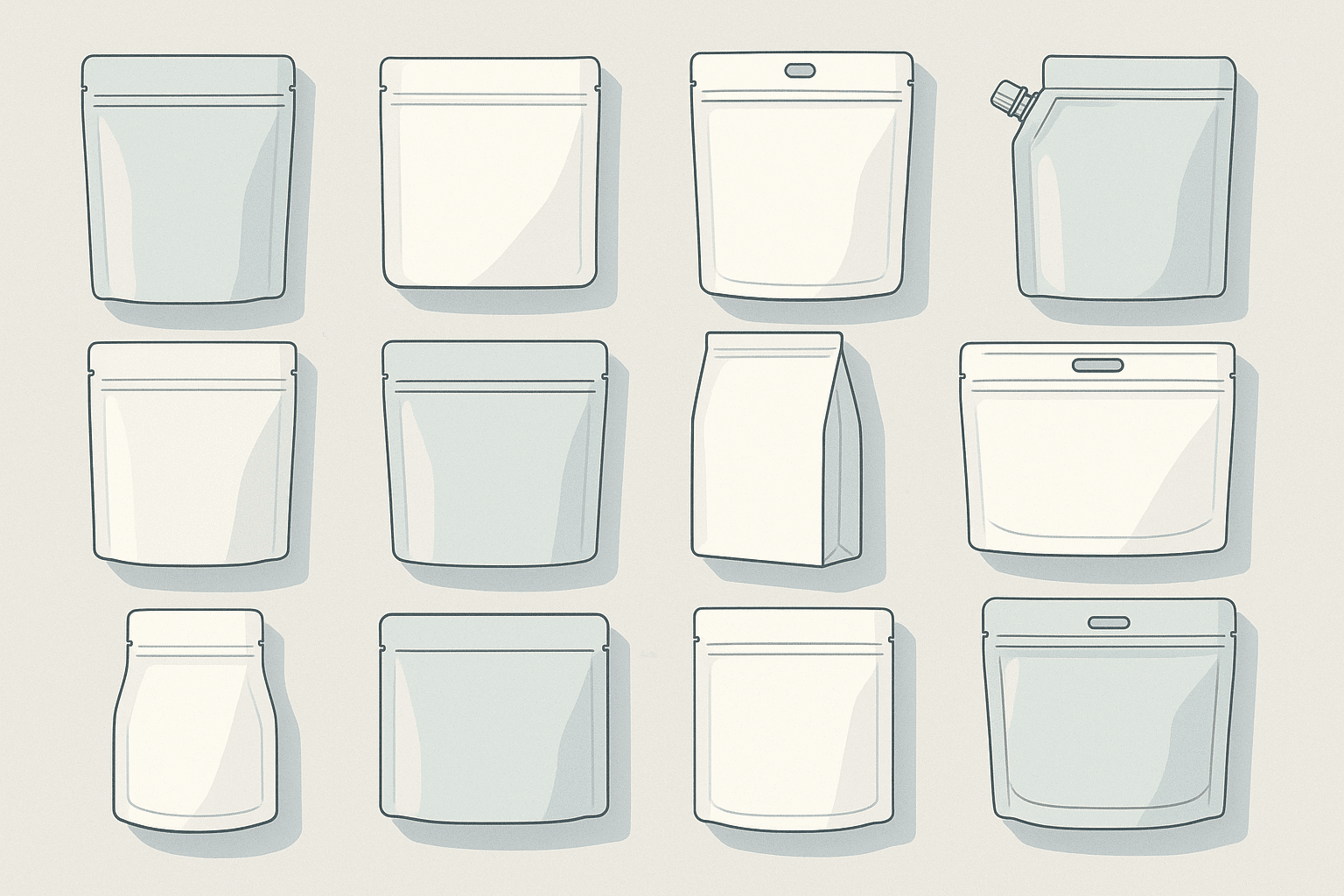
The twelve essential prompt types for custom pouch packaging design include: structural prompts (stand-up, flat-bottom, side-gusset specifications), material prompts (barrier properties, recyclability requirements), visual prompts (color schemes, window placement), functional prompts (zipper types, spout configurations), sustainability prompts (mono-material structures), regulatory prompts (FDA compliance), production prompts (minimum order quantities), brand story prompts, consumer experience prompts, shelf impact prompts, cost optimization prompts, and converter compatibility prompts.
You might wonder why so many beautiful designs fail in production. The answer lies in understanding these prompt categories before starting any design work. Let me walk you through each type and show you how to use them effectively.
What Are Structural Design Prompts for Pouches?
Many clients come to me asking for "innovative" packaging without understanding structural basics. They want something unique but don’t realize that pouch structure determines everything else.
Structural design prompts define the physical architecture of your pouch. These include specifications for stand-up pouches with bottom gussets (typically 25-38mm depth), flat-bottom box pouches (requiring 5-panel construction), side-gusset pouches (with 15-50mm gusset width), three-side seal flat pouches, and specialty shapes like shaped pouches or spouted pouches. Each structure has specific seal requirements, typically 8-12mm for standard applications.

I learned this lesson when a client wanted an ultra-thin bottom gusset for aesthetic reasons. I was working with their engineering team, measuring sample pouches with calipers, when we discovered their ‘aesthetic’ 20mm gusset created a center of gravity issue. The filled pouches would tip forward when placed on standard retail shelving (which has a 4-degree backward tilt). It was a physics problem disguised as a design preference. The pouch couldn’t stand properly on shelves. We had to redesign everything.
Key Structural Specifications
Stand-up pouches need specific dimensions to function properly. The bottom gusset must be at least 25mm deep for pouches under 250g capacity. For larger pouches holding 500g or more, I recommend 35-40mm gussets. The ratio between pouch width and gusset depth affects stability. A 130mm wide pouch works best with a 30-35mm gusset.
Flat-bottom pouches require different considerations. They need reinforced corner seals and proper material distribution across five panels. The base panel should be at least 60% of the face panel width for optimal stability. Side panels typically measure 40-50% of the face width. These ratios ensure the pouch maintains its box-like shape when filled.
How Do Material Selection Prompts Impact Design?
Designers often create beautiful concepts without considering material limitations. But material properties dictate what’s actually possible in production.
Material selection prompts specify barrier requirements, sustainability goals, and converting capabilities. These include oxygen transmission rates (OTR) below 0.1 cc/m²/day for coffee, moisture barriers under 0.01 g/m²/day for snacks, puncture resistance above 50N for pet food, and recyclability requirements like mono-PE or mono-PP structures. Material choices affect opacity, printability, seal strength, and whether certain design elements like metallic effects or transparent windows are achievable.
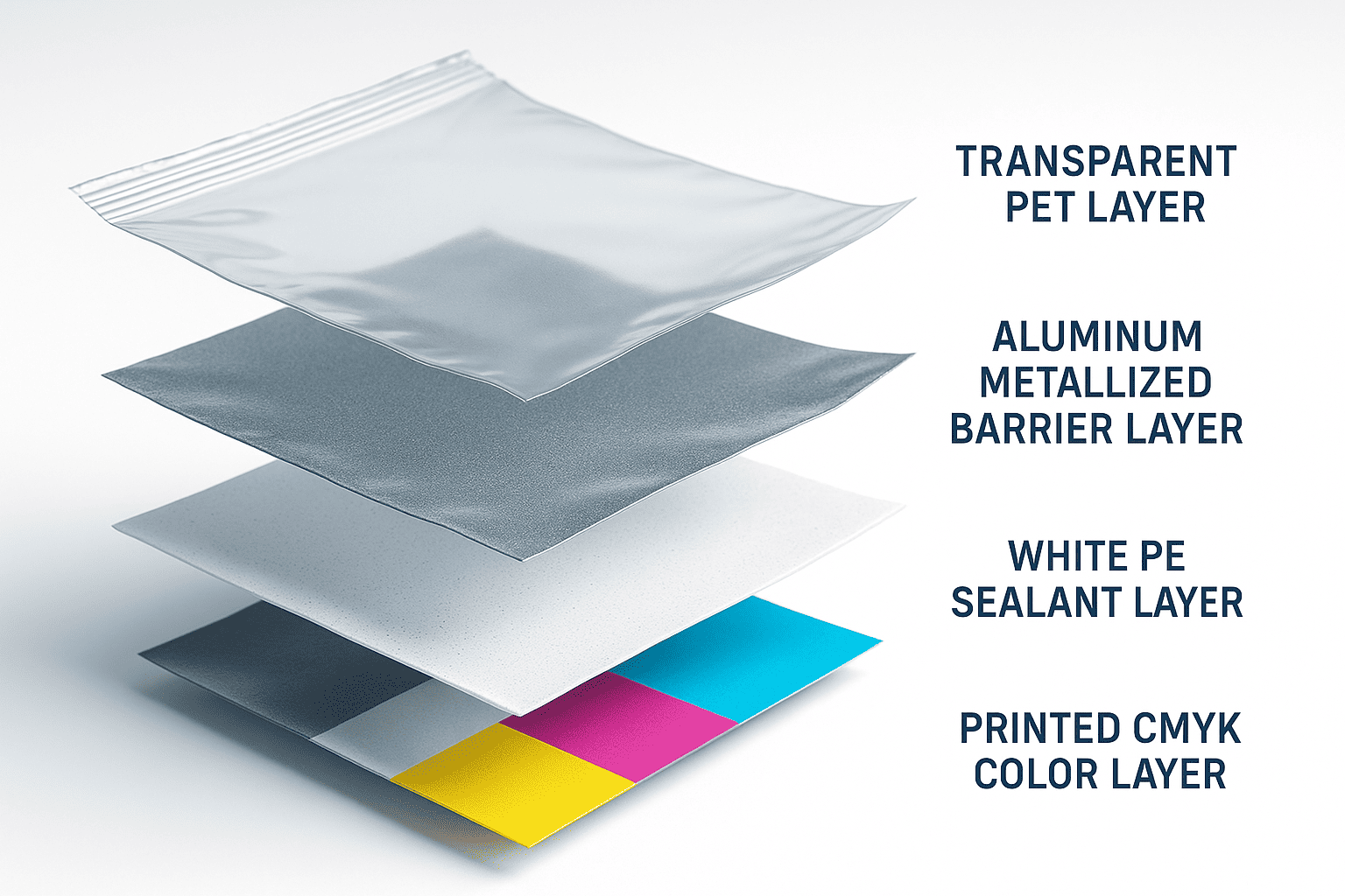
Material prompts go beyond just choosing "plastic" or "paper-like" finishes. You need to specify exact structures. For coffee packaging, I typically recommend PET/PE or PET/EVOH/PE structures with aluminum metallization for maximum barrier protection. These materials allow full CMYK printing plus spot colors while maintaining oxygen barriers below 0.1 cc/m²/day.
For sustainable options, mono-material structures are becoming mandatory in many markets. Pure PE structures work well for dry goods with OTR requirements above 1.0 cc/m²/day. These recyclable structures limit design options though. You can’t achieve the same metallic effects or opacity gradients that multi-layer structures allow. Clear windows become challenging because mono-materials typically lack the stiffness of PET layers.
Compostable materials present even more constraints. PLA-based films have heat resistance limits around 50°C, affecting filling processes. PBAT blends offer better heat stability but cost significantly more. Both materials have shorter shelf lives than traditional plastics, requiring faster inventory turnover.
What Visual Design Prompts Drive Shelf Appeal?
Visual prompts seem straightforward, but they interact with technical specifications in complex ways.
Visual design prompts encompass color specifications (Pantone or CMYK values), finish types (matte, gloss, soft-touch, or combinations), window shapes and positions, graphic placement relative to seal areas, and special effects like spot UV, foiling, or embossing. These must account for 3-5mm registration tolerances, seal area keep-outs of 10-12mm, and how graphics wrap around three-dimensional forms when filled.
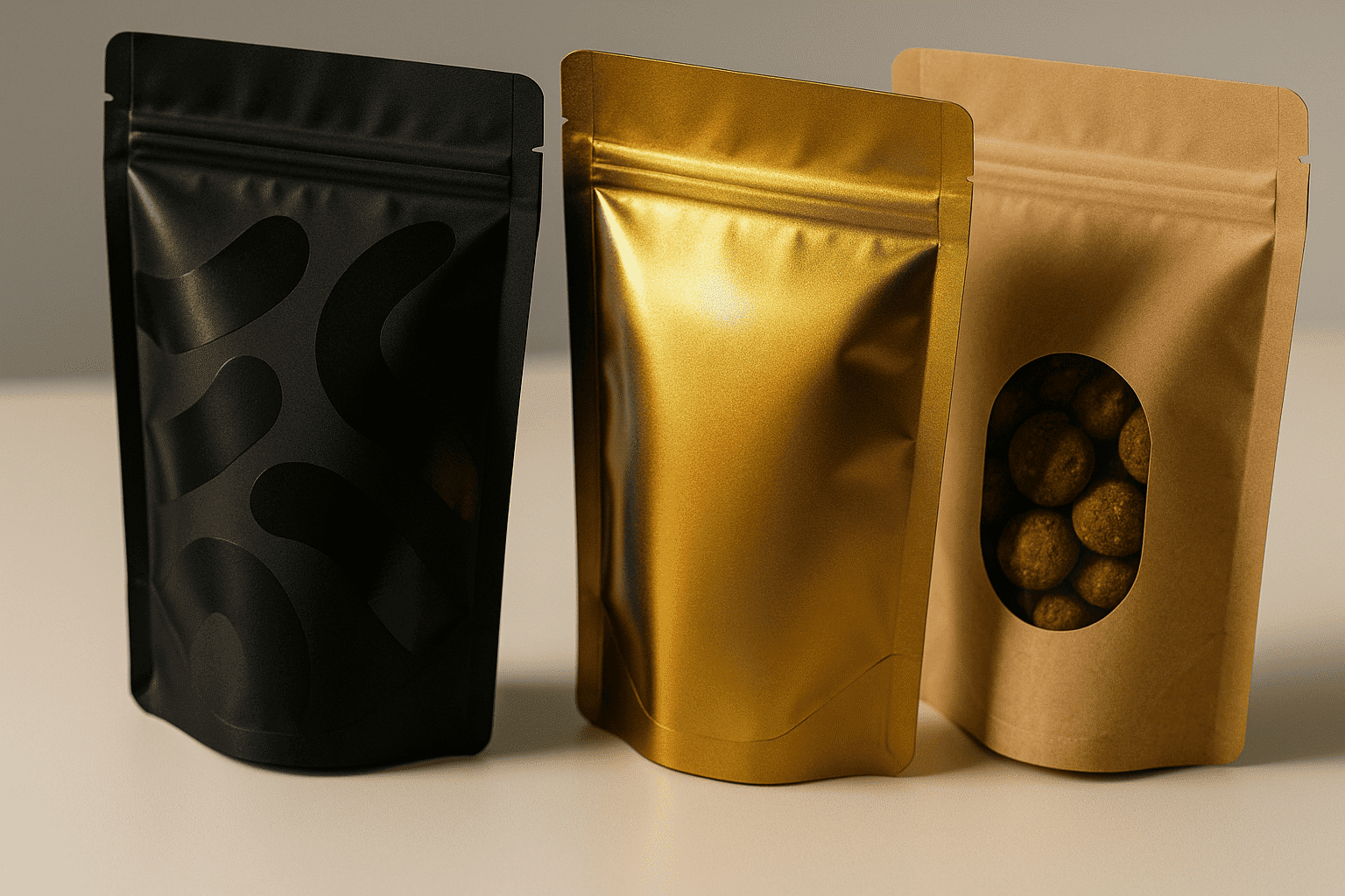
Color reproduction varies significantly between materials. Transparent films print differently than white films. Metallized substrates shift color values, especially in the yellow and red spectrums. I always request color matching on actual production materials, not just paper proofs.
Window placement requires careful planning. Windows can’t overlap seal areas or extend into gussets where material folds. For stand-up pouches, I position windows at least 15mm above the bottom seal and 20mm below the top seal. Side clearances need 12mm minimum from heat seals. Shaped windows cost more but create stronger shelf differentiation. Heart shapes work well for chocolate, leaf shapes for tea, and oval windows for pasta products.
Special finishes multiply costs but dramatically increase perceived value. Matte varnish over gloss substrate creates elegant contrast without expensive soft-touch coatings. Spot UV on matte backgrounds makes logos pop at fraction of foiling costs. These effects require vector artwork and additional printing plates, adding $500-1500 to setup costs.
How Do Functional Feature Prompts Affect Design?
Functional features seem like add-ons, but they fundamentally change design parameters.
Functional feature prompts include closure systems (press-to-close zippers, slider zippers, or velcro), pour spouts (center or corner positioned), tear notches (laser-scored or die-cut), handles (die-cut or attached), and specialized features like one-way valves for coffee or steam vents for microwave applications. Each feature requires specific placement zones and affects the available design area by 20-40%.
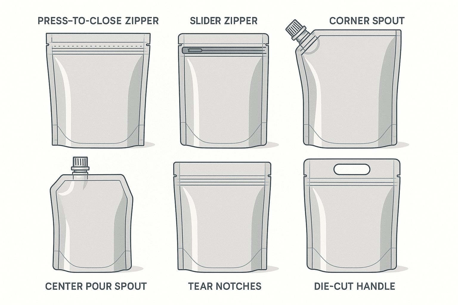
Zipper placement determines everything about top panel design. Standard press-to-close zippers need 30-35mm clear space from the top edge. Slider zippers require 40-45mm. This dead zone can’t contain important graphics or text. I’ve seen countless designs ruined because designers didn’t account for zipper placement.
Spouts change the entire pouch geometry. Center spouts work best for liquids but limit graphic space on top panels. Corner spouts preserve more design area but require special filling equipment. Spout fitments come in standard sizes: 8.2mm, 8.6mm, 10mm, and 16mm openings. Larger spouts cost more but improve pour rates for thick products like smoothies or baby food.
Pour spouts need reinforced seal areas extending 25mm around the fitment. This creates a circular dead zone for graphics. Corner spouts affect side seal integrity, requiring wider seals (12-15mm versus standard 8-10mm). These wider seals reduce the printable area by roughly 10% compared to standard pouches.
What Sustainability Prompts Shape Modern Design?
Sustainability isn’t just a trending topic anymore. It’s reshaping every design brief I receive.
Sustainability prompts1 specify recyclability requirements2 (store drop-off compatible, curbside recyclable, or compostable), material reduction targets3 (typically 20-30% less than current packaging), renewable content percentages, and end-of-life instructions. These prompts often conflict with barrier requirements and shelf-life needs, requiring careful balance between environmental goals and product protection.
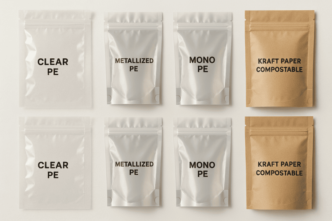
Mono-material mandates are transforming design possibilities. Traditional multi-layer structures allowed designers to combine different plastics for optimal performance. Now, everything must be PE or PP compatible. This means no PET layers for stiffness, no EVOH for extreme barriers, and no nylon for puncture resistance.
I work with converters to maximize mono-PE performance. New PE films4 achieve 85% of PET stiffness through orientation processes. Metallization on PE provides adequate barriers for most snack foods. These structures meet Store Drop-Off recycling requirements while maintaining 12-month shelf life for dry goods.
Compostable options5 require completely different design approaches. Home compostable films have limited barrier properties and shorter shelf lives. Industrial compostable materials perform better but need specific disposal infrastructure. Both options cost 40-60% more than conventional plastics. Graphics must include clear disposal instructions taking up valuable package real estate.
How Do Regulatory Compliance Prompts Guide Design?
Regulatory requirements often surprise designers who focus only on aesthetics.
Regulatory compliance prompts6 cover FDA food contact compliance7, child-resistant closure requirements, tamper-evident features, nutritional panel placement (minimum 6-point font), allergen declarations, country of origin marking, recycling symbols and instructions, batch code placement, and specialized certifications like organic, kosher, or halal. These requirements can occupy 30-40% of available package space.
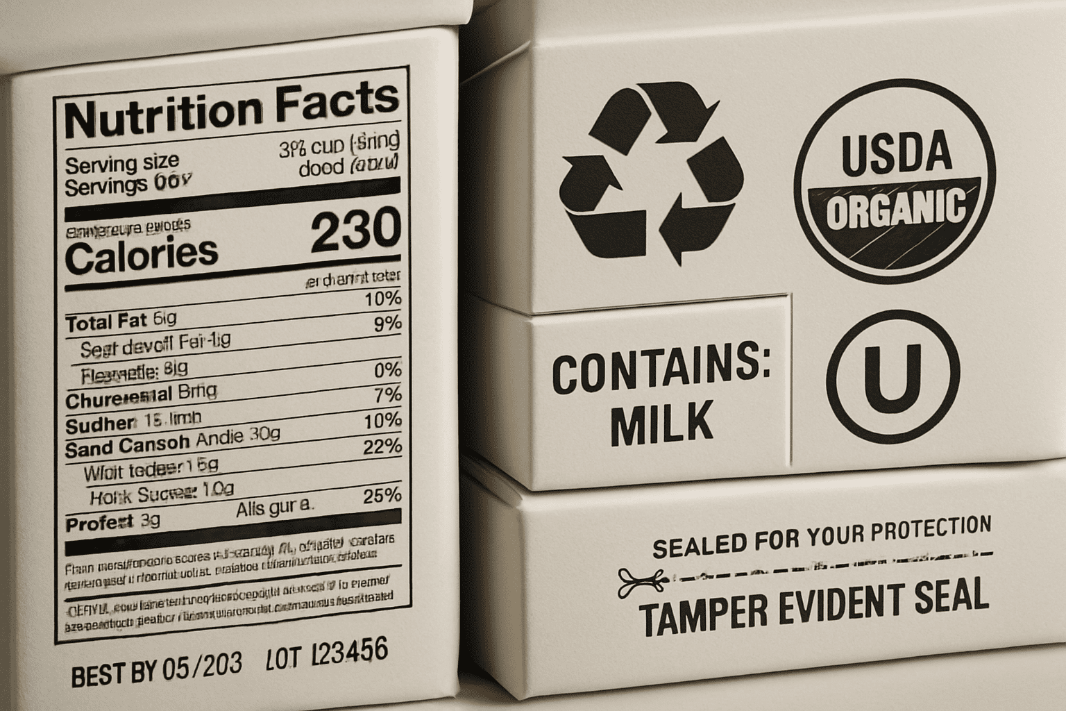
FDA compliance goes beyond just using food-safe materials. Migration testing ensures inks and adhesives don’t contaminate products. Low-migration inks cost more but are mandatory for direct food contact. Barrier layers must prevent ink components from reaching food, even after extended storage.
Child-resistant features drastically change design layouts. Senior-friendly CR zippers need instruction panels with 8-point minimum fonts. These panels require high contrast between text and background. Testing protocols mandate that 85% of seniors can open packages within 5 minutes. This limits complex opening mechanisms that might enhance tamper evidence.
International markets multiply compliance complexity. EU regulations differ from FDA requirements. Canada mandates bilingual labeling. Australia requires country-of-origin percentages. Each market needs different recycling symbols and disposal instructions. I maintain compliance matrices for 15 major markets to ensure designs meet all regional requirements.
What Production Constraint Prompts Limit Design Options?
Production realities crush many creative concepts. Understanding constraints upfront saves time and money.
Production constraint prompts8 include minimum order quantities9 (typically 10,000-50,000 pieces), plate cylinder sizes (affecting repeat lengths), web widths (typically 300-1000mm), registration tolerances (±3mm standard), color limits (typically 8-10 colors maximum), and converting equipment capabilities. These constraints determine feasible design complexity10 and affect unit costs by 20-50%.
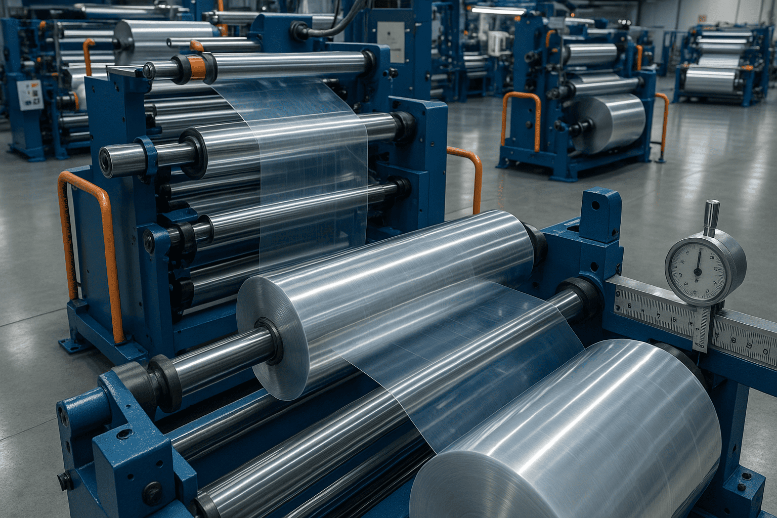
Printing plate costs drive many design decisions. Rotogravure cylinders cost $1,500-3,000 per color. Digital printing eliminates plate costs but increases per-unit prices by 30-40%. Flexographic printing balances cost and quality for runs between 25,000-100,000 pieces.
Web width limitations affect pouch sizes and printing efficiency. Standard web widths run 400mm, 600mm, 800mm, and 1000mm. Designing pouches that nest efficiently on these widths reduces waste and cost. A 140mm wide pouch fits three-across on 420mm webs but wastes material on 400mm webs.
Registration tolerances mean designs need buffer zones. Text must stay 5mm from edges. Critical graphics need 3mm clearance from folds and seals. Multi-color elements require trapping to prevent white gaps. These technical requirements reduce usable design space by roughly 25% compared to theoretical dimensions.
How Do Brand Story Prompts Create Emotional Connections?
Technical perfection means nothing without emotional resonance. Brand story prompts11 bridge this gap.
Brand story prompts translate company values into visual design elements. These include heritage cues (established dates, founder signatures, origin stories), quality indicators (certifications, awards, process highlights), value propositions (convenience, sustainability, premiumization), and emotional triggers (nostalgia, adventure, health transformation). Effective prompts balance storytelling with technical requirements.
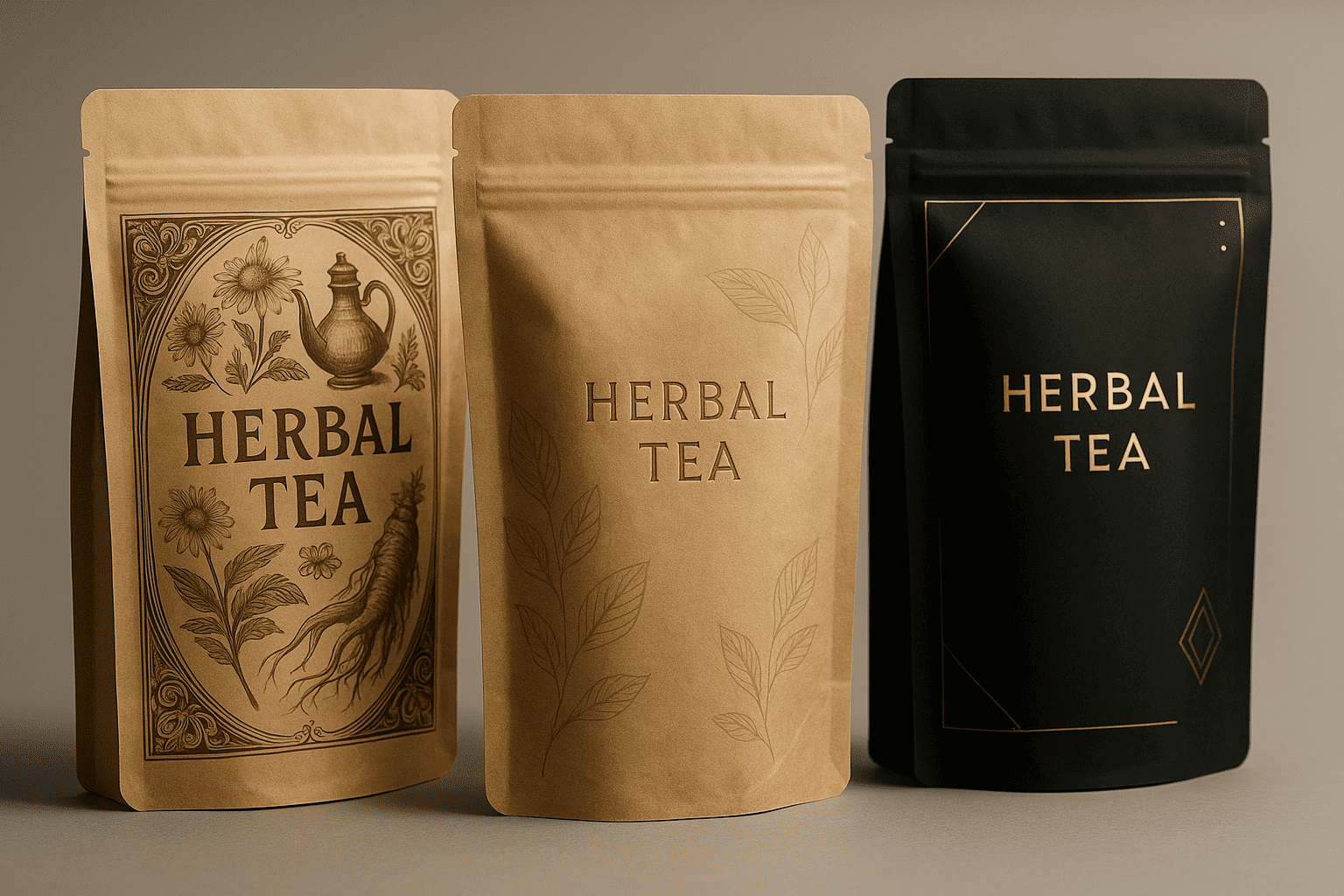
Heritage brands leverage history through vintage typography and sepia-toned imagery. But nostalgic designs must still meet modern technical standards. Vintage-style illustrations need vector conversion for clean printing. Period-appropriate colors must reproduce accurately on modern substrates.
Premium positioning requires subtle sophistication. Soft-touch coatings signal quality but add $0.03-0.05 per pouch. Metallic accents convey luxury when used sparingly. Too much gold or silver looks cheap rather than premium. I recommend limiting metallic elements to 15-20% of the design area.
Sustainability stories need visual validation12. Printing "eco-friendly" isn’t enough anymore. Consumers expect kraft-like textures, earth tones, and minimalist designs. These aesthetic choices must align with actual sustainable materials. Using brown kraft appearance on non-recyclable laminates creates distrust. Authenticity matters more than aesthetics in sustainability messaging.
What Consumer Experience Prompts Enhance Usability?
Packages must work in real kitchens, not just photo shoots. Experience prompts address practical usage.
Consumer experience prompts13 focus on opening ease, reclosing reliability, dispensing control, storage efficiency, and visibility of remaining product. These include grip zones for arthritis sufferers, viewing windows for inventory checking, portion control features, microwave compatibility, and freezer performance. Good experience design can increase repurchase rates by 25-40%.
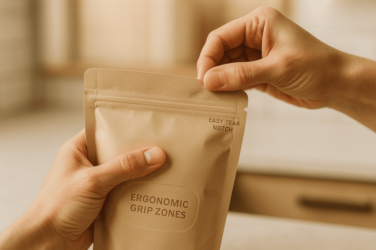
Opening experiences make first impressions. Tear notches must actually work, not just look functional. Laser scoring provides consistent tear initiation at 2-3 pounds force. Die-cut notches cost less but vary more in performance. Position notches where consumers naturally grab packages, typically 20-30mm from top corners.
Reclosability determines product freshness and consumer satisfaction. Press-to-close zippers need adequate finger space above and below the closure. I specify 15mm minimum clearance zones. Zipper profiles must match product requirements. Heavy granules need stronger closures than lightweight powders. Testing zipper performance after 50 open-close cycles ensures long-term functionality.
Storage efficiency affects purchase decisions. Pouches must fit standard cabinet depths (280-300mm) and shelf heights (300-400mm). Excessive headspace wastes storage room. I optimize pouch dimensions for common serving sizes while maintaining proper fill ratios. 60-70% fill levels provide optimal appearance and functionality.
How Do Shelf Impact Prompts Win Retail Placement?
Retail shelves are battlegrounds. Design must fight for attention and win.
Shelf impact prompts14 maximize visibility and differentiation in retail environments. Key elements include billboard zones (top 40% of package face), color blocking for brand recognition, contrast ratios exceeding 7:1 for readability, and viewing angles accounting for top, middle, and bottom shelf placement. Effective designs achieve recognition within 0.5 seconds from 6 feet distance.
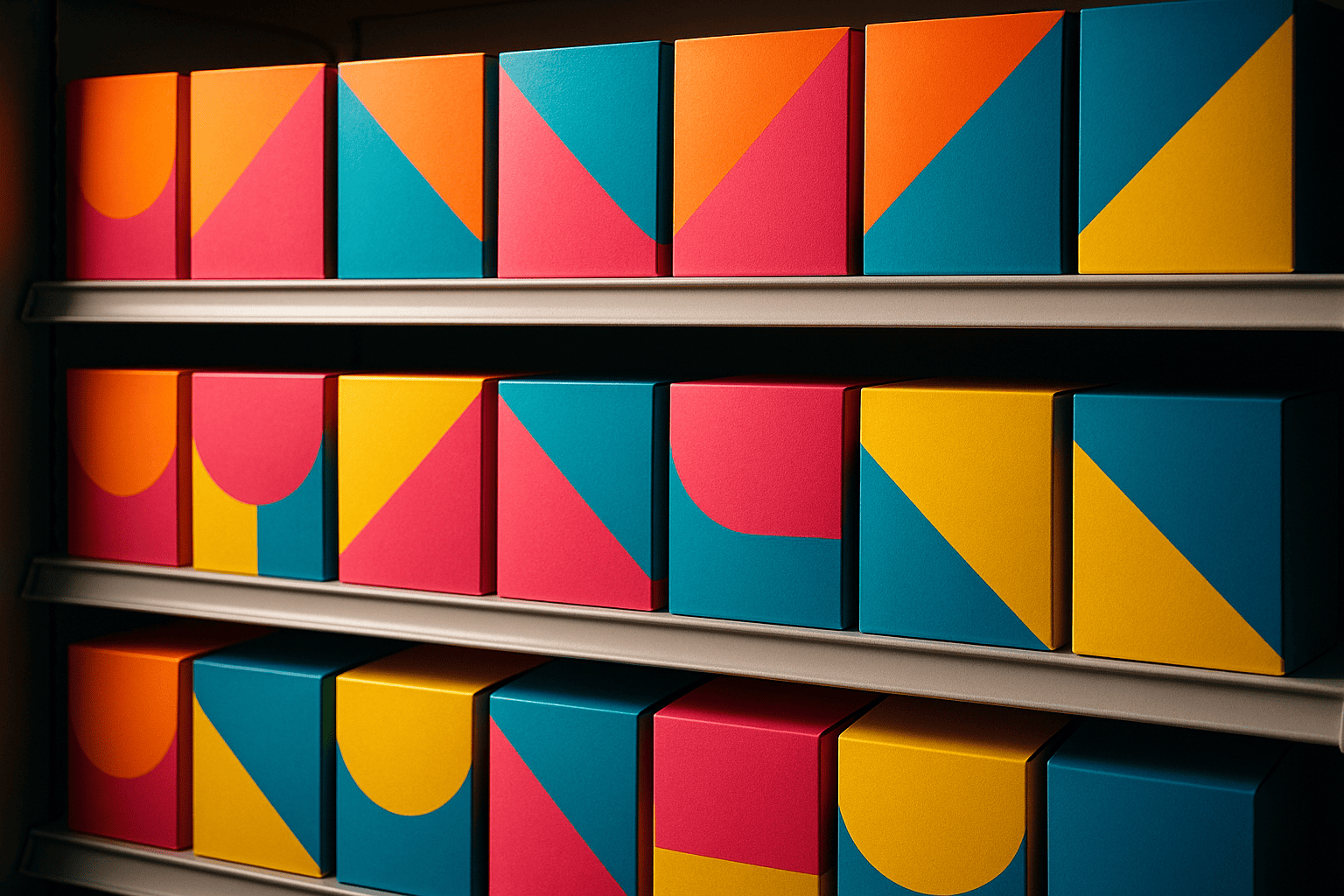
Billboard zones communicate core messages instantly. This top portion remains visible even when pouches overlap on crowded shelves. I place brand names and key benefits in this zone using high-contrast colors. Product imagery can extend below, but critical information stays in the top 40%.
Color blocking creates brand walls when products display together. Consistent color bands across SKUs build visual mass. But individual products need differentiation within the system. I vary secondary colors or graphic elements while maintaining primary brand colors. This strategy increases shopping basket size by encouraging multiple SKU purchases.
Viewing angles change dramatically by shelf position. Top shelf placement requires graphics readable from below. Bottom shelves need upward-facing elements. Middle shelves allow standard front-facing designs. Many designers ignore these viewing angles, creating packages that only work at eye level. Testing designs at actual shelf heights reveals visibility problems before production.
What Cost Optimization Prompts Balance Quality and Budget?
Every design decision affects cost. Smart prompts optimize value without sacrificing quality.
Cost optimization prompts15 identify opportunities to reduce expenses while maintaining functionality. These include material downgauging (reducing thickness by 10-20%), standardizing sizes across product lines, minimizing color counts, eliminating special effects on non-critical elements, and optimizing cutting patterns. Effective optimization can reduce packaging costs by 15-30% without compromising performance.
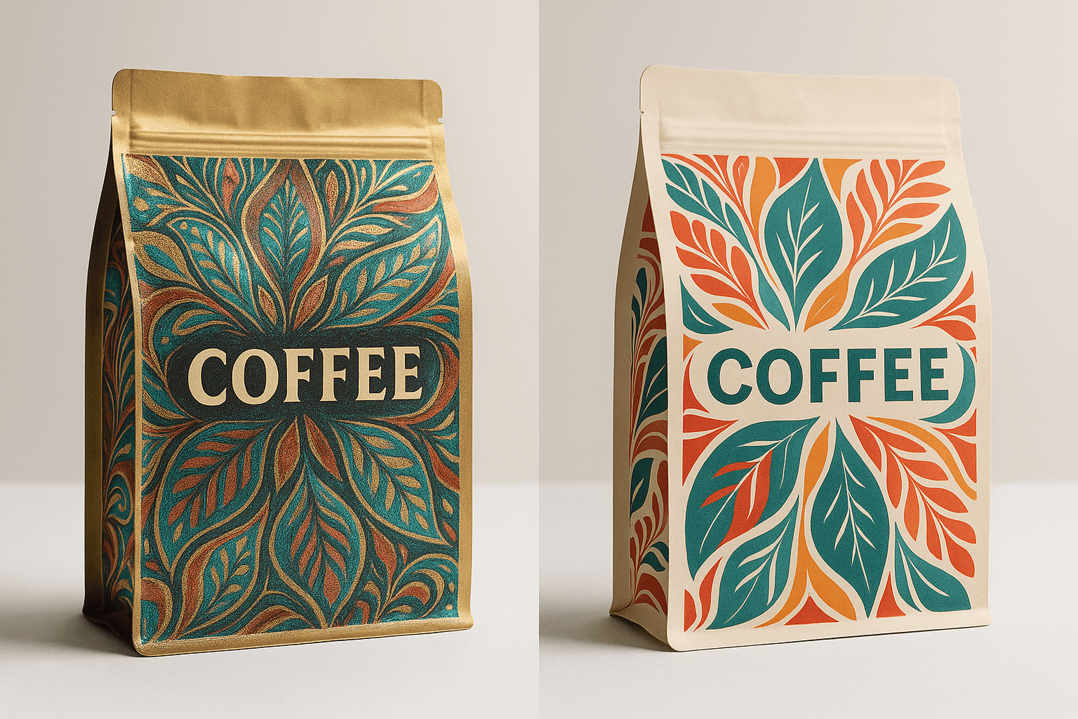
Material optimization starts with right-sizing barrier properties. Many clients over-specify requirements based on assumptions rather than testing. Coffee doesn’t always need maximum barriers. Products with 3-month shelf lives don’t need 18-month capable packaging. I conduct shelf-life testing to determine actual requirements, often reducing material costs by 20-25%.
Standardization across SKUs reduces inventory complexity and costs. Using common pouch sizes for different fill weights simplifies operations. Three standard sizes can typically accommodate 8-10 SKUs through fill weight variations. This approach reduces plate costs, inventory requirements, and changeover times.
Color reduction doesn’t mean boring designs. Strategic use of 4-5 colors can achieve similar impact to 8-color designs. Overprinting creates additional colors without extra plates. Halftone variations provide tonal range. White space becomes a design element rather than wasted area. These techniques maintain visual appeal while reducing printing costs by 30-40%.
How Do Converter Compatibility Prompts Ensure Manufacturability?
The best designs mean nothing if converters can’t produce them efficiently.
Converter compatibility prompts16 ensure designs match production capabilities. Critical factors include seal bar configurations, cutting die limitations, quality control requirements, and machine speeds. Designs must accommodate converter-specific requirements like minimum seal widths, maximum web speeds, vision system markers, and waste optimization patterns. Incompatible designs can increase costs by 40-60% or become impossible to produce.
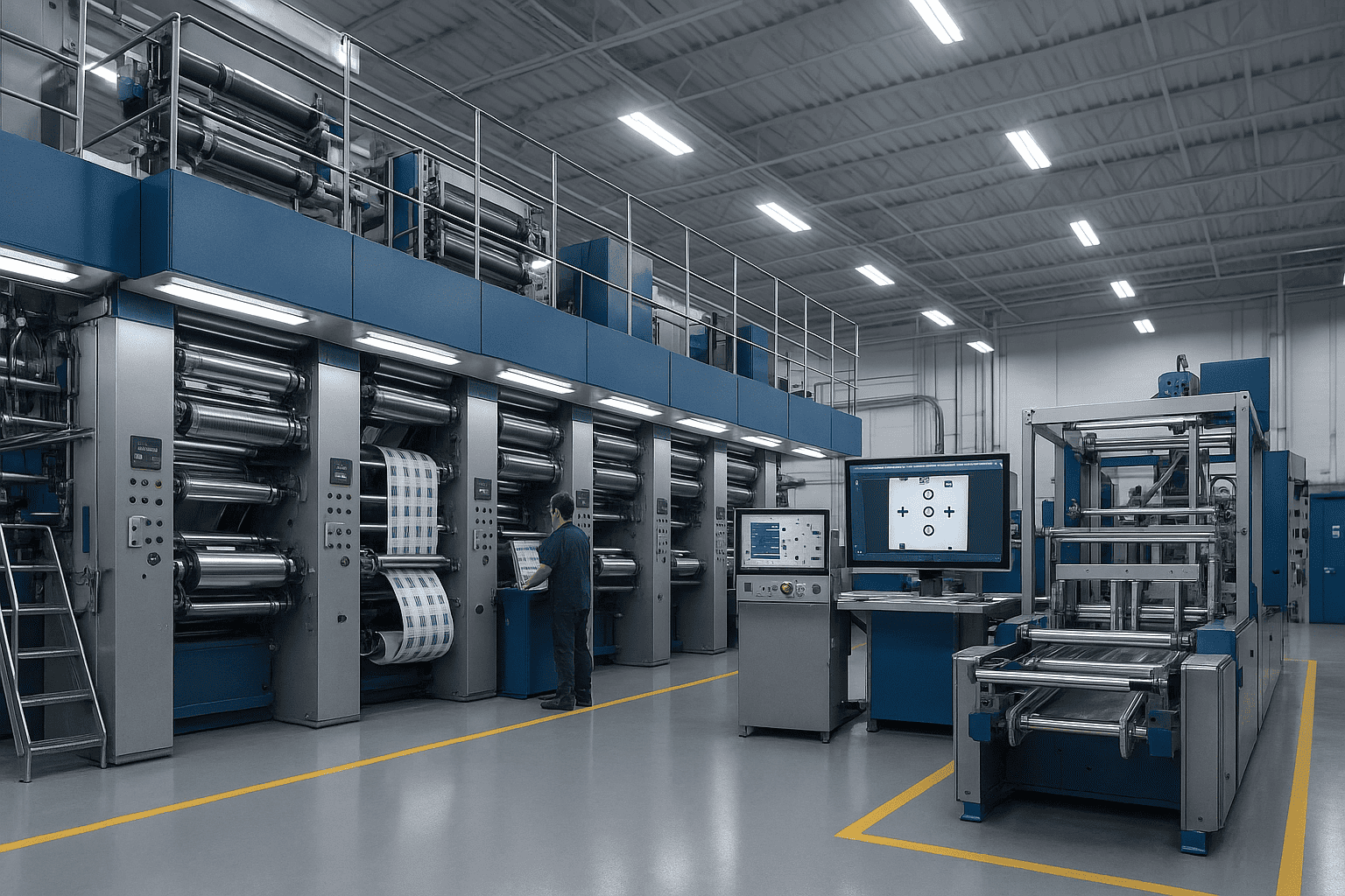
Different converters have different sweet spots. Some excel at short runs with quick changeovers. Others optimize for million-piece orders. Machine configurations vary widely. One converter might handle 12-color printing while another maxes out at 8 colors. Understanding these capabilities before designing prevents expensive redesigns.
Seal bar configurations determine possible pouch shapes. Standard straight seals cost least. Shaped seals require custom tooling costing $5,000-15,000. Some converters have libraries of existing shapes. Using their standard tooling saves money and time. I maintain databases of converter capabilities and existing tooling to match designs with optimal producers.
Quality control systems need specific design elements. Vision systems require registration marks and color bars. Metal detectors limit foil usage. Check-weighers need consistent tare weights. These technical requirements seem minor but affect production speeds and costs. Designs incompatible with QC systems slow production and increase defect rates.
Frequently Asked Questions About Custom Pouch Packaging Design Prompts
1. What’s the minimum information needed for a basic pouch design prompt?
You need at least five elements: pouch type (stand-up, flat-bottom, etc.), size specifications (width x height x gusset), product type and weight, required shelf life17, and order quantity. These basics let converters provide initial feasibility and pricing.
2. How do sustainability requirements affect design prompt complexity?
Sustainability requirements typically double prompt complexity. You must specify recyclability level, material restrictions, disposal instructions, and certification requirements. These constraints often conflict with performance needs, requiring detailed compromise specifications.
3. Can I use the same design prompts for different converters?
Basic design elements transfer between converters, but production specifications vary. Each converter has unique capabilities and limitations. I modify prompts based on specific converter requirements while maintaining core design intent.
Conclusion
Understanding these twelve types of custom pouch packaging design prompts transforms your approach from pure creativity to strategic design. Technical constraints aren’t limitations but guidelines that ensure your beautiful concepts become successful products on shelf.
-
Explore how sustainability prompts shape design requirements and influence eco-friendly practices. ↩
-
Learn about the different recyclability requirements that impact packaging design and consumer choices. ↩
-
Understand the importance of material reduction targets in sustainable packaging and their impact on the environment. ↩
-
Find out how PE films are used in packaging and their advantages over traditional materials. ↩
-
Explore the different compostable options available and their implications for sustainable packaging. ↩
-
Learn about the regulatory compliance prompts that ensure packaging meets safety and legal standards. ↩
-
Understand the significance of FDA food contact compliance in packaging design for food products. ↩
-
Learn how production constraints affect design options and influence packaging feasibility. ↩
-
Explore how minimum order quantities impact packaging design and production costs. ↩
-
Understand the various factors that contribute to design complexity and how to manage them effectively. ↩
-
Discover how brand story prompts create emotional connections through visual design elements. ↩
-
Explore the concept of visual validation and its role in authenticating sustainability claims. ↩
-
Learn about consumer experience prompts that enhance usability and satisfaction with packaging. ↩
-
Explore how shelf impact prompts maximize visibility and differentiation in retail environments. ↩
-
Find out how cost optimization prompts can help balance quality and budget in packaging. ↩
-
Understand the importance of converter compatibility prompts in ensuring manufacturability of designs. ↩
-
Discover how shelf life affects packaging design choices and consumer perceptions. ↩

